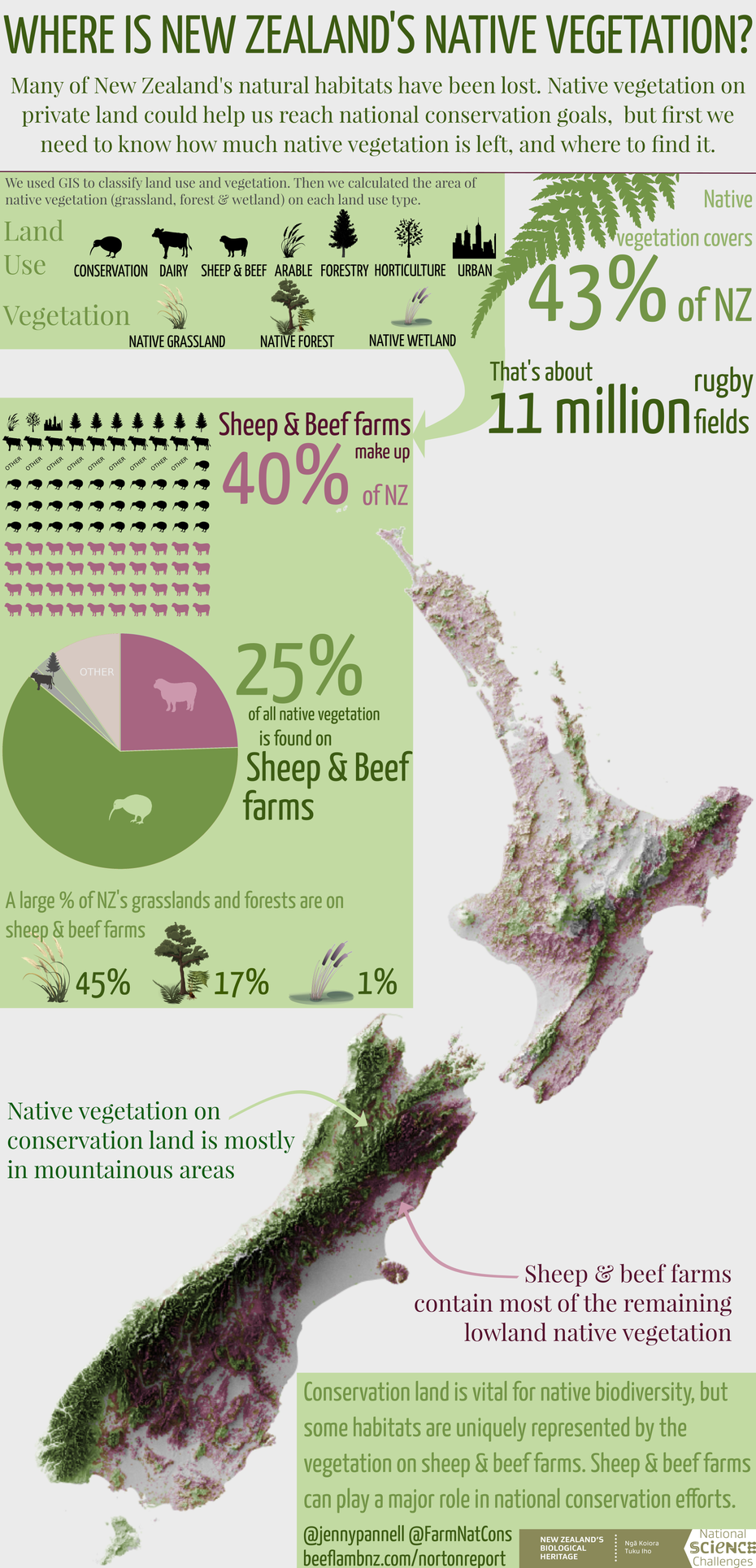
Something I've been wanting to do for a while is learn how to make beautiful infographics, or at least mildly attractive ones, and I recently had an opportunity to give it a go with the Farming & Nature Conservation team. We decided that a summary of key results of our report on native vegetation on sheep & beef farms would be good for the project's social media.
Only problem - none of us have any experience in design. But you can learn anything through the University of Google, right?
General design and layout
This was actually the hardest thing to get right, and we had a few iterations before we were all happy with it. I used this handy guide as a start, and we decided on a vertical layout with a width of 600 pixels in order to make it smartphone-friendly (the consensus from various guides like this one, that I found from googling "best size for inforgraphic")
In our infographic, we had a few elements: some explainer text, a methods box to explain how we measured the native vegetation, a couple of graphs to show proportions of land use/vegetation results, some key statistics in text, and a map of NZ with the distribution of native vegetation on it, then finally some conclusions text. We chose the map as the focal point, and tried to arrange the rest so that it flowed logically from to top to bottom.
Another key thing that took us a while was reducing the amount of text while still keeping the important messages there. When writing for a general audience, it's really important to avoid jargon, technical detail and overly complex language. But as scientists, we also want to be really precise to avoid presenting misleading results. This took a lot of iterations to get right but in my opinion was the most important aspect of the whole design process.
Map
I wanted the map to be the focal point of the infographic and to really "pop". If you follow @mapmakerdavid on twitter (and you really should), you'll know the kinds of maps I'm talking about - the terrain looks like it's coming out of the screen at you, they really are things of beauty.
As it turns out, you need to use a 3D modelling software to produce the effect, as the hillshade tools in ArcMap or other GIS software just won't cut it. I only partly understand the reasons for this - essentially, the algorithm that produces the effect in GIS is much simpler than these 3D modelling programmes, which simulate how light will refract and bounce from different materials and surfaces to create a more realistic effect.
I opted to use the open source software Blender to create my map of NZ, and simply followed a step by step tutorial to produce it. As an aside, it is SUPER important to not skip the first step of this tutorial which is just about navigation (like I did...), because if you do, you will run into problems about half way through.
The output of that tutorial is just a greyscale elevation map though, and I wanted colours to show the distribution of native vegetation. To achieve that, I opened the resulting tif in QGIS, georeferenced it (because it's just an image that comes out of Blender) and overlaid my native veg shapefile.
Why QGIS? Well, I learned from my AUT colleague Graham (thanks Graham!) that QGIS has much more sophisticated options than ArcMap for overlaying layers and blending them without the end result looking flat. Highly recommend playing around with the options in QGIS if you want to create pretty maps!
Fonts
I might have overly strong opinions about fonts, but I do think it's a really important and often under-appreciated aspect of how we present our work. Font choice can make our work look sophisticated and professional, it can draw people's attention and keep it, and it can make the difference in our work being accessible to a wide audience or not. Note - this is not a claim that I have always got this right or am any kind of font expert!
I followed the advice on this really useful post when choosing my infographic fonts, and found my ideal pairing here - I chose Yanone Kaffeesatz and Playfair Display
Graphs & figures
All of the graphs and figures were made with a combination of the open source Inkscape and GIMP software (GIMP for editing images, Inkscape for drawing and arranging multiple images).
Because I'm a novice, I sourced open source vector images to use for the artwork. I have now bought an illustration pad for my PC though, so next time I plan to make my own!
Plan your social media distribution before you start designing
We actually ended up making two inforgraphics because we also wanted to share it on instagram, which of course requires a square format. Annoying! In addition, when you share on facebook and twitter, these cut the image off for the preview, both in slightly different ways and this varies depending on what device you use. If I had to do this again, I would first of all plan what platforms we wanted to share this on, then make a list of the image requirements and formats, then decide on the dimensions of the infographic. You live and learn!
The end result